1. Sum up the reading in your own words in 1 paragraph:
The reading was relatively short. However, there was a lot of really interesting things to learn about "hippie art". Drugs, hippie mentality, and the cultural revolution of the 60's preaching free love into the 70's made for an exciting time to see some new innovations in art. The reading contributed images that exemplified the psychadelic art style that used a wide variety of merging colors and weird design patterns. Civil rights movements, hippie subculture of the 60's and the Vietnam War were all world events that contributed to this style. The whole anti-establishment idea of the culture was the main inspiration behind most of the posters that one would see from the psychadelic era. Most designers from the era that are well known were self taught and mainly designed posters that were made to sell concerts or ideas (like do drugs, be happy, ect.). Robert Wesley "Wes" Wilson was one of them, making innovations in patterns and typography.
2. Name the one thing (or person) you found most interesting from the reading.
I found psychadelic posters in general to be super interesting. This is really the first time in design history where we see people making posters that weren't necessarily trying to sell you a product, but rather an idea. Psychadelic posters were created to sell you ideas like "take some drugs, go listen to some music, go make love, have fun." I just think that's really cool.
3. State at least one question you have after the reading or from last class.
Did that one free press company go out of business because it was too anti-establishment or what was up with that? The text didn't really elaborate.
Saturday, May 16, 2009
Friday, May 15, 2009
Presentations #5
I came late to the fifth and final day of presentations, but I was able to see some movie title sequences and trailers that some dude made. She said that whoever he was, was Saul Bass inspired and it definitely showed. Anyway, it appears that was all he did.
Next was V@rner's presentation on Shepard Fairy. Fairy has the whole rebel punk style and is known for his Andre the Giant "OBEY" sticker, which implies big brother is watching you. He went to Rhode Island School of Design and began putting up his designs in the form of stickers and graffiti around skate parks. Currently, Fairy's most noted work is with the Obama campaign poster design, which he is currently in a law suit with the Associated Press over fair rights since he used and barely altered an image of President Obama from newspapers. Most of his art, also being applied to such band posters as Led Zeppelin, have an Art Deco theme/style to them, and almost always have some hidden political message/agenda.
Wednesday, May 13, 2009
4th day of Prsentations
4th day started with the man himself, Stefan Sagmeister. He was born in Austria in 1962 and began his studies in Asia. While there, he found his biggest influence and hero, Tibor Kalman, and decided that he would go into graphic design. Most (if not all) of Sagmeister's designs have a hand-written element to them. His style is very unconventional, and as seen by how he carved words into his body, insane to a point. Sagmeister describes himself as computer illiterate, and therefore never used much technological resources. He is most noted for his work with musicians, having done album covers for bands like rolling stone. He even won an award for his design of the Talking Heads CD Box set. I would say Sagmeister's pretty anti-establishment, having made a campaign to cut the pentagon's budget with pig shaped cars.
Last was Sarah's presentation on Leo Burnett, the guy with the crazy super cool website. I enjoyed playing around with that. Anyway, Burnett is well known for having created some of America's (and the world's) most well recognized characters such as Tony the Tiger and Tucan Sam. I thought that the whole apples theme was really interesting, since it was just a big F-You to those that said he would never achieve success.
Next we had Jenna's presentation on Clement Mok. Mok started his career working for Apple in the 1980's, a pretty good company to start off with. He applied his talents not only to design, but publishing and education as well. He's pretty much just known for the wide variety of clients he had and the corporate identities(logos) he created for them. Her presentation didn't really give any influences Mok had, or was at least vague enough that I didn't notice.
Last was Sarah's presentation on Leo Burnett, the guy with the crazy super cool website. I enjoyed playing around with that. Anyway, Burnett is well known for having created some of America's (and the world's) most well recognized characters such as Tony the Tiger and Tucan Sam. I thought that the whole apples theme was really interesting, since it was just a big F-You to those that said he would never achieve success.
Monday, May 11, 2009
Presentatons 3rd Day
The third day started off with Katie's presentation on David Carson. Yet again we have a kind of designer turned CEO scenario. Carson is most noted for his work with Ray Gun, MGM Studios and Xerox companies. He got most of his inspiration from Surfing and it showed in many of his designs (since a lot of them were covers for surfing magazines or promotional material for surfing equipment/places, ect..) Unlike many of the designers we've seen so far, Carson had no formal education after high school. He skipped learning the rules and just stuck to breaking them, as is seen especially in his typographical work.
Next we had Matthew Carter, a big designer from London. His father was a substantially successful typographer and Carter was able to get most of his education in design through an apprenticeship with him. Most of his typography designs were created to make lettering fit nicer (like in phonebooks), and generally look nicer. He had a great Renaissance influence and a love of seraphs which he played around with a lot. Generally, carter created numerous typefaces that are still used today. What I thought was interesting and most noteworthy was his invention of ink traps, little spaces in the letters that allowed for ink to print off the type without smudging. He was really innovative.
Friday, May 8, 2009
2nd Day Presentations
The second day of presentitons started with Barb's look into the life and times of Neville Brody. Not unlike my designer (Storm Thorgerson), Brody started off his career working with musicians. Designing album covers, concert posters, t-shirts for bands such as Depeche Mode. Throughout his career, Brody was able to keep his passion for surfing and sometimes even combine his work with it. As his fame as a designer grew, Brody kind of broke away from work with musicians to start Face Magazine and work with other various british magazines, as well as create new typefaces such as "Fuse". The book that was written about him and his design was and is the best selling book about graphic design. I thought Neville Brody just generally had the best life ever. He got to work with musicians, make designs for international magazines, made one of the coolest looking typefaces I've ever seen, and is still able to just chill and surf. What am I doing with my life?
Next we had Amanda's presentation on Art Chantry, the man who had a rough childhood, but took those experiences and made something out of them. It was nice to see something different. Other presentations so far just had the typical kind of formula: "What'd he do? What'd he make? Where's he now?", but we got a little look into Chantry's childhood sketches. It was interesting and funny to kind of see where a legendary graphic designer's drawing abilities were when they were a kid. Apparently, Chantry never got into using computer technologies for his designs, and I can kind of see why based on the style I was seeing during this presentation. Chantry had a theme of using "recycled art", taking clips of drawings from newspapers or books and then combining them onto a press. A lot of his work is punkish, dirty, and offensive, but that's just his style. A lot of his stuff is compared to Dadaist concepts, and it's pretty obvious why. He would recycle images and put them in offensive or dirty situations which suggests the notion that whether beautiful or disgusting, art can be anything.
Wednesday, May 6, 2009
1st Presentations
The 1st day of presentations started off with Allie's designer: April Greiman. She was born in 1948 and still operates today owning her own successful design firm. She was inspired by her mother and the sayings she was taught like "you can't fake the cha-cha". Greiman took this to mean that no one could fake who they were. After going to art school, Greiman created a "new wave design concept", a style tat broke from normal typography and played around with stretching the spacing and weight of lines and curves. She went on to use computers to make stunning graphics. I actually didn't like her style since it seems like someone went into photoshop and just took google images and arranged them together. It just seemed like idiotic art that was trying to be avant garde.
Next, Sam presented Milton Glaser. I was already a little familiar with him, since he's famous for his album and poster art for Bob Dylan. He was born in 1929 in New York, studied in Italy, and began his career with push-pin studios. Throughout his career life, Glaser developed his own kind of style that was based on directness, simplicity, and originality. Glaser would go on to found a variety of companies based around design, like New York Magazine in 1968. In 1974, he established his own company, Milton Glaser Inc. Operating his own business, Glaser was free to explore other design styles and came up with his most notable image: the I (heart) NY thing. It was interesting to learn that Glaser created it, since I always thought it was just some thing that started on shirts for tourists by an unknown giftshop man. Anyway, he won the award for best designer presented in this specific class from me, since he was the most dynamic. The man went through a lot of different styles in his career, from Victorian images and type to things with Art Deco kind of feels, he's done it all. The presentation wasn't really clear on what inspired him, but I think there were definitely some psychadelic style influences on his later life
Anna's presentation was on Seymour Chwast. I really enjoyed seeing her design imitations, they were just cool to look at and caught my attention very well. Chwast was born in 1931 and was big into illustration and wood cuts. During his career he created the push pin almanac (from working with push-pin studios). Most of his images were like a different, but similar, version of the work we saw in posters during the World War I&II. However, his images had a more abstract, "new-age" feel.
Wednesday, April 8, 2009

Chapter 20 and 21
1. Sum up the reading in your own words in 1 paragraph:
Chapter 20 starts off explaining, yet again, the advances in technology during World War II. Progressions in mass production of goods and the economy itself (being taken off the Gold Standard) led to a demand for design in corporate identity. AEG, for example, comissioned Peter Behrens to create a recognizeable logo for their company. Behrens would undoubtedly be known throughout history as one of the founders (if not the father) of corporate identity. Camillo Olivetti founded the Olivetti Corporation, and his son Adriano comissioned artist and designer Giovanni Pintori to create a simple concept of futuristic text, even his most complex designs had a simplicity about them. The design of CBS's corporate identity was a big concept in the chapter. The then President of CBS, Frank Stanton and his colleague William Golden designed CBS' "eye in the sky" design. The chapter also talks about the first African American to become a successful and prominent graphic designer. George Olden held a high paying position designing for CBS and other TV stations even before the civil rights movement. His style was based heavily on the use of symbolic imagery and had a habit/theme of working with silhouettes. The chapter goes on to talk about Lou Dorfson, William Golden's predecessor becoming the new President of CBS. became the director of all of CBS after Golden's death. We then move to the corporate identity of IBM, who's main player was Paul Rand. Rand designed logos not only for IBM, but NeXT, Westinghouse, and Westinghouse as well. The chapters go down the list of other designers that created corporate identity logos such as Lester Beal, who created logos for Connecticut General Life Insurance and the International Paper Company to name a couple. created corporate identities for Martin Marietta, Connecticut General Life Insurance, and the International Paper Company. I guess Beal considered himself an expert on the subject of corporate identity because he wrote a manual explaining some guidelines as to what images help people memorize and connect it to business' as well as what kinds of lines, shapes and images create positive images that would relate to the company, ect. The chapter ends with some examples of transportation signage and how it evolved over the years.
2. Name the one thing (or person) you found most interesting from the reading.
I enjoyed reading about Behrens again, since he had been mentioned in class before we were assigned to read this chapter. It was interesting to get some deeper information on him since he's basically the father of corporate identity.
3. State at least one question you have after the reading or from last class.
Why did IBM not try to contract/keep Paul Rand, rather than actually allow him to be comissioned to design for their rival computer company?
Tuesday, April 7, 2009
Chapter 19
1. Sum up the reading in your own words in 1 paragraph
The New York School style of art was the birth of magazine art, using layouts with a focus on one main image in the middle of lines of text. The book concentrated on this style much in the same fashion as the previous chapter, with a focus on its founders: Paul Rand, Alvin Lustig, Saul Bass, Bill Bernbach, Alex Steinweiss, Robert Brownjohn, and George Tscherny. Rand was the designer that really pioneered the movement. He started out with a heavy use of simple contrast on his images/photos. Saul Bass was responsible for the creation of a variety of corporate logoes and programs. He also created the world's first ever animated sequence for a movie title: The Man With the Golden Arm, a movie about drug abuse. Bass was really the first graphic designer to be involved with making corporate identity for film, he worked very closely with a lot of directors including the infamous Alfred Hitchcock. Most of the other important figures in this era of design worked in advertising firms, but others like Saul Bass off from this traditional place for graphic designers into other industries and became art directors at record companies and clothing companies.
2. Name the one thing (or person) you found most interesting from the reading.
I really love Saul Bass' work. He really took two passions of visual art and combined them to do what he loved. I just think that's really something to aspire to.
3. State at least one question you have after the reading or from last class.
So was the New York School just a style or did it come out of an actual "school"?
Chapter 18
1. Sum up the reading in your own words in 1 paragraph
The International Typographic style came about during the 1950's.It was a design movement that emerged from Germany and immediately migrated to and became closely associated with switzerland (the style was also known as "Swiss Design"). Signatures of the style included clarity and conciseness in design, heavy mathematical methods for proportions; and we have seen geometric influences on other styles, but this style had a focus on abstraction of simple geometric shapes. Some "founders" of the movement included: Theo Ballmer, Ernst Keller, Max Huber and Max Bill, Anton Stankowski, and Rudolph DeHarak. I recognized Theo Ballmer when I read the chapter and realized it was because he had been a student that moved up in the Bauhaus. Ballmer developed a mathematical grid that he used constantly in his designs so that everything could be aligned to his idea of perfection. Ernst Keller taught how to use the style for advertising when he was employed at the School of Applied Art (Kunstgewerbeschule) in Zurich, Germany. The chapter continues to tell the stories and backgrounds of the rest of the Swiss Design style's founders and developers. Each having a unique and innovative idea to contribute to its growing popularity. Max Bill used the concepts from art concrete to produce very mathematically driven bright desings in his architecture and sculptures. Stankowski was an influential photographer who was eventually commissioned to participate in a design program being started in Berlin in 1968. And so on and so forth.
2. Name the one thing (or person) you found most interesting from the reading.
I found Stankowski to be very interesting and was dissapointed that he wasn't as expanded on in the book as other designers from the era. It was nice to read about someone that used arithmatic influences and simplicity in photography. I just thought it was cool because I viewed it as a kind of follow up to Man Ray in a different style.
3. State at least one question you have after the reading or from last class.
How was something so simple and so organized so popular? I mean, these designers did a pretty good job of applying abstraction to simple shapes, especially DeHarak, but I still think it's kind of a boring style after a brief viewing of a piece from this era of design.
Friday, April 3, 2009

Thursday, April 2, 2009
More design sketches


These are my completed pieces from sketches I drew earlier. The first is a depiction of Bob Marley in a cubism style with just a swirl of rasta colors for the background. The second is a kind of Frank Lloyd Wright inspired design. I made it with a design for a rug or maybe a stained glass window in mind. I didn't make either of them for a specific purpose or reason, there's no marketing scheme going on here. I just like Bob Marley and wanted to create some images that I found aesthetically pleasing. No poster popped up in my mind for either of these styles, least of all for cubism. I don't really see Picasso's style as particularly geared towards advertising like most of the ones we've learned about.
Monday, March 30, 2009
Iraqi Posters

I liked the poster design of America with the travel stamp FRAGILE printed over it. I thinkit's cool to me personally because you have to actually think, but not for too long, to understand what this image means. It's trying to portray that the U.S is shipping our culture, ideals, and government over to Iraq. Perhaps there's underlying deeper analytical messages, like that the U.S is making a hostile takeover seem like merely shipping a letter.


American Kitsch
1. Sum up the reading in your own words in 1 paragraph.
The Urbandictionary.com reading describes American Kitsch as design that is "tacky". From what I understand it's a paradoxical style, which makes it very interesting. What I mean by paradoxical is that the style is "pleasingly tacky", it's aesthetically pleasing yet of poor taste. It's described as gaudy and folksy, almost exclusively using curves in design styles along with rebelious and dramatic poster images. The word "kitsch" was taken from German and is translated to mean "in poor taste".
The Urbandictionary.com reading describes American Kitsch as design that is "tacky". From what I understand it's a paradoxical style, which makes it very interesting. What I mean by paradoxical is that the style is "pleasingly tacky", it's aesthetically pleasing yet of poor taste. It's described as gaudy and folksy, almost exclusively using curves in design styles along with rebelious and dramatic poster images. The word "kitsch" was taken from German and is translated to mean "in poor taste".
2. Name the one thing (or person) you found most interesting from the reading.
I think that the style's paradoxical nature is very interesting. People view it as tacky and ugly, yet the style's progressed and still shows up today because we, in America, have found some sort of sentimental value in it.
3. State at least one question you have after the reading or from last class.
Probably an unanswerable question, if Kitsch is considered to be art/design of such poor taste, why is it loved?
Art Deco
1. Sum up the reading in your own words in 1 paragraph.
This chapter of the text talked about a new style that emerged from the influences of styles from the modern art movement, including De Stijl and Cubism. The geometric based style in Art Deco was popular in the early 20th century and was most notably seen between the 1920's and 30's. Art Deco had a poster style that was much like Art Neuvau, but sacrificed the detail and decoration for simplified geometric shapes with a rather basic color scheme. American, Edward McKnight Kauffer was a noted designer of the Art Deco style. He began his education in the arts in the U.S, but moved to Europe to study since he felt that America was too slow in accepting modern art. Kauffer's focus was on poster design, creating a series of posters for London's Underground that were meant to encourage tourism. Another famous designer of Art Deco was A.M. Cassandre, a Ukranian artist. Cassandre studied art and design in France and also worked on posters, mostly in Paris. His trademark in the style of his posters was to reduce the main object in the image to one iconic symbol and combine it with a variety of bold geometric forms. Cassandre also extended his talents to typography, creating the Bifur, Peignot and Acier Noir typefaces. The chapter also goes on to tell us (in less detail) about other influential designers in the Art Deco style, such as Paul Colin and Jean Carlu.All of them noted poster designers as well.
2. Name the one thing (or person) you found most interesting from the reading.
I thought that the designs Kauffer made for London's Underground were pretty cool. I like how the images are simple, but catch your eye as if it were some kind of intricate renaissance painting.
3. State at least one question you have after the reading. (if you state none here, you’d better have more detail done above to offset the work.)
How did Kauffer's newspaper become so famous when it was, as the text states, "Flawed"?
Chapter 16
1. Sum up the reading in your own words in 1 paragraph.
Chapter 16 starts with the Bauhaus, which I will tell you all about in class and will write about in excruciating detail in my paper, so on we go to where the book left off with the De Stijl style. The Bauahus was introduced to De Stijl three years after the style's creation (1919) by one of the school's faculty, Lyonel Feininger. In 1919 De Stijl was introduced to the Bauhaus community by teacher Lyonel Feininger. By 1920 the De Stijl typographic style was beginning to make headway in Russian, and some German, newspapers and magazines, but was not liked by many other places in Europe. The chapter continues with Laszlo Moholy-Nagy, an avid artist who experimented with designs in a number of mediums, including: painting, sculpture, film, and photography. He liked to experiment with just about every factor contained in the art, the environment it's created in, the material used, combining two or more mediums, ect. He was a very influential artist at the time of shifting to change in the "Bauhaus era". After the Bauhaus' dissolve due to the Nazi party in 1933, the chapter shifts its focus and preambles the changes that are to take place in sans-serif and typography in general.
2. Name the one thing (or person) you found most interesting from the reading.
I found it to be most interesting that the Bauhaus was disliked by the Nazi regime. I can't see any clear definition why they wouldn't like the use of form and function and having the idea of reproduction in mind when creating artistic AND practical things (like chairs and teapots and all that good stuff).
3. State at least one question you have after the reading.
So...why did the Nazi regime put the Bauhaus down? Was it their art style in particular or was it the artists that they didn't like? What's up?
Chapter 15
1. Sum up the reading in your own words in 1 paragraph.
Chapter 15 start us out with communism in Russia and explains to us the impact of the political climate Russia had created not just in Europe, but throughout the world. Communistic design was like a mixed experimentation of both shape and typography using notable features from both the futurism and cubism styes. The book goes on to tell us about Kasimir Malevich, creator of the style of painting known as suprematism. Suprematism is the use of basic shapes and bold primary colors to combine the art of geometric precision with creative abstraction. Another figure-head designer of the time was Kandinsky, a partner of Malevich's. Both men argued that art had to come back to being purely spiritual and aesthetic in practice. Malevich and Kandinsky led a revolt against the old art that grew out of the World Wars, art that was conservative and organized. The chapter then turns its attention to the creation of constructivism. Lissitzky was the designer of constructivism. He created a style of painting that set the cornerstone of the style. It utilized 3D illusions, exhibiting that painting and architecture were very much an intertwined practice in creative thought. Lissitzky called the style PROUNS. Meanwhile, the Netherlands started their own movement in 1917, an ill recieved abstract/geometric style by Theo Van Doesburg called "De Stijl".
2. Name the one thing (or person) you found most interesting from the reading.
I found it ineteresting that there's a pattern going on here. Throughout late 19th to early twentieth century times there's a struggle going on between simplification and ornamentation. There's an endless kind of tug-o-war going on for years between those that think art should move towards a simplification of shape and line and those that think art should always have a humanitarian side, that think ornamentation is a structure of beauty.
3. State at least one question you have after the reading.
Do you think that either side of the simplistic vs. ornate battle have won? Has the conflict been resolved? Is one more predominant than the other nowadays? Or will the struggle between them never end?
As seen on posters
Victoria's presentation locked us in on how modernism and its methods in art were geared towards the creation of propaganda for the war effort, much of that propaganda being in the form of a poster. Half of our classtime was spent focusing on this concept, then she instructed us to play pictionary in groups. I found it very interesting that more people understood the word we were trying to portray better and quicker if the pictographer simply drew the object(or rather a representation of the object) itself(like show airplane by drawing an airplane). I chose to draw a person using the object I was supposed to show(a pen) and even though people ended up understanding it, it still probably took more time than it would if I had just simply drawn a pen. Most of the questions we went over were from chapter 13 and had a focus on Futurism and Dadaism and the way they function. I was able to contribute my two cents on Dadaism. Overall it was a nice day of learning for me.
Chapter 14
1. Sum up the reading in your own words in 1 paragraph.
Guess what we got to read about? More designs from the early twentieth century! However, the key difference here is that this chapter's focus was primarily on propoganda and posters. In particular, Dudley Hardy stands out among all the advertising names. Of his various contributions to this era of design, the most prominent was probably his formula of text and figures against a flat background for theatrical posters. He was also key to the introduction of French graphic pictorial qualities to billboards in London throughout the 1890s. "Beggarstaffs" was an group of artists James Pryde and William Nicholson. who developed the technique of collage. Pryde and Nicholson took the name off of a sack of corn (technically it said Beggarstaff Brothers). Since the times in Europe were hostile to any artists in general, they wanted to protect their anonymity as artists, leading to the development of Beggarstaffs. In 1894, they opened an advertising graphic design studio. Beggarstaffs was a huge success, especially with the "invention" of the collage as an artistic technique, but the studio's financial status went under quickly. Next we have another style contribution from Germany, Plakatstil. Art in this style had its focus on simplified big images, flat color background, and the name of the product.
Continuing with what seems to be the trend of simplification and a rejection of naturalism in art from this progressive era, Lucian Bernhard moved towards a visual formula of signs and shapes by developing an alternated version of type. It was basically a new sans-serif with broader stroke lines. Bernhard also whet his artistic appetite with commercial and interior design and architecture. He did move to America where his art work was not widely accepted because it was too different and naturally, we as humans don't really appreciate change when it happens. It would take Bernhard 5 years to become a recognized name in design in the U.S. The main differences between Central Powers' and Allied Powers' posters was in the main difference between Hardy's French graphic pictorial designs and Julius Klinger's plakatstil/Vienna Secession style designs. The Central Powers had their propaganda present the message through more abstract symbolism in their drawings. The Allies had their propoganda take a more literal approach with detailed life-like designs, focusing a large proportion of their efforts to more traditional illustration. The Central Powers would push the message of saving their leaders and their country, while the Allied Powers constructed their message around the protection of traditional values, the family and the home.
2. Name the one thing (or person) you found most interesting from the reading.
I found it very interesting that until now I had no idea that the Uncle Sam poster was a remake from a British artist that created a similar design. It's kind of funny, but at the same time shocking because that poster and its image is a very noticeable part of our country's history and I found out it's kind of a copy-cat.
3. State at least one question you have after the reading.
Did Hitler ever host his own little art show or something like that while he was in power? Or did he ever contribute some kind of poster propaganda himself?
Sunday, March 29, 2009
From Cubism to...more isms
Alexis' presentation went over the various art movements of the early twentieth century or "WWI Art". She displayed different key characteristics in each movement and made some of the blurs between their art more clear. But still, there was some confusion between Futurism and Surrealism by all 3 of the groups we were separated into. I think the confusion comes from the fact that both futurism and surrealism have extreme tendencies towards the abstract. If you look at the sculpture from futurism and the yellow painting from surrealism you'll see what I'm talking about.
Tuesday, March 24, 2009
Chapter 13
1. Sum up the reading in your own words in 1 paragraph.
This chapter continued to describe the changes going on in the earlier twentieth century, with most of the focus being on typography and poetry. Most of these changes involved socioeconomic ones (rise of communistic thought and other "leftist" things, ect..). Political changes in society had a particular impact on new advertising methods and styles. For instance, African tribal designs and geometric lines influenced Paul Cezanne's and Pablo Picasso's new style Cubism. Not only were there new styles, but there were also new major art movements. For this era, art was "at war" with new progressions in science and machinery. The famous poet, Filippo Marinetti was the man responsible for beginning Futurism. These new movements had a kind of "anti-harmonious" attitude in their art. One such group out of this era's movements that took their chaotic sense of style to extremes were the Dadaists. Dadaism was a style of art that rebelled against the conventional idea of art. They argued that art could be anything, therfor their work was considered ironic art. For instance, probably the biggest name in Dadaism: Man Ray, was a photographer that used things like unorthodox dark room techniques to make very strange pictures. Other movements included expressionism and surrealism, two big art movements in Europe during the early twentieth century. Surrealism was anathema to Dadaism. Those of the surrealist movement sought to bring back intricacy, humanitarian themes and spiritual influence back to art. "The Bridge" and "The Blue Rider" were the largest groups of people following the expressionist movement. The Bridge worked mostly with expressing feeling through subject matter and material art(sculptures). The Blue Rider expressed feeling with perceptions given by an object. Between these larger movements were other smaller art forms that also had a backlash to the destruction of World War One: suprematism, constructivism, and De Stilj.
2. Name the one thing (or person) you found most interesting from the reading.
I just find Dadaism in general to be an interesting movement in art. I don't think Dadaism's idea that art can be anything will ever die. I'm sure that the question "define art" had come up before Dadaism, but the effort by the movement has echoed that unanswerable question and made an impression on artistic thought for all time.
3. State at least one question you have after the reading.
With all of these styles talked about in the chapter having their "distinctions" there are a lot of underlying themes (World War One) that are very similar. Could any of the art displayed in the book be considered more than one style or displaying characteristics of more than one movement?
Wednesday, March 11, 2009
Exemplary Image 5

This is a sketch of the H.C Price Company Tower by Frank Lloyd Wright. Wright sketched and worked on the building's construction in his later years (the 1950s). I saw this sketch in a book, The Drawings of Frank Lloyd Wright by Arthur Drexler. I just thought it was really interesting and a unique piece of work to consider in Wright's life since the Price Tower is the only recognized skyscraper attributed to his work. It's pretty amazing how a sketch could be so detailed, and how this simple drawing on a piece of paper translated into an entire huge building.
Genesis Design Presentation
Todays class was led by Anna's presentation on the 20th century Genesis design. The most obvious and essential figure of this period in the progression of design was Frank Lloyd Wright. He seems like one of (if not the) most influential graphic artists to come out of America. The most interesting things I learned about him from the presentation was he used his ideas of spacial design and asymmetry in his architechture.
Sunday, March 8, 2009
Chapter 12
1. Sum up the reading in your own words in 1 paragraph.
We begin chapter 12 with the creation of the Glasgow School of art, a school geared toward teaching a new and original style that used symbolism and a dissmissive attitude towards traditional art. The school was created by artists Charles Rennie Mackintosh, J. Herbert Mcnair, and the sisters Margaret and Frances Macdonald, affectionately refered to by graphic history as "The Four". They worked on combining floral and curvulinear temperament into their work with advanced geometric structure added to their designs. At first it seems like nothing different from any other movement in art we've seen thus far, just more intense detail and use of different mechanics in creating designs. However, a big difference with the Glasgow school of thought is the large focus on architechture it would soon be known for. Of the four, Mackintosh was the most influential with architechture and buildings, but he seems to become overshadowed by the more famous Frank Lloyd Wright. Wright was an American architect who defined organic design with his idea that space is the essence of art.
2. Name the one thing (or person) you found most interesting from the reading.
I found Tawlin Morris to be pretty interesting. THere's yet another reference in the book to an artist I share last names with. But other than that, I just thought it was cool how he was one of the key players in the movement of the Glasgow school of thought in design since he brought the influence into England.
3. State at least one question you have after the reading. (if you state none here, you’d better have more detail done above to offset the work.)
Does the Underground sign design have any connection with the badge of the British Royal Airforce? I noticed they have relatively the same circle design with the same color scheme.
Tuesday, March 3, 2009
You asked for it

 Anna's question was: "Did the European style of the art nouveau movement take anything more from the ukiyo-e style than the organic lines and shapes?"
Excellent question Anna. According to the research I got. the European style adopted Ukiyo-e style's of lines and shapes, but what they (French mostly) were most fascinated with was Ukiyo-e's compositional freedom in placing the subject off-centre(sharpened images), the lack of perspective and shadow, and flat areas of strong color. For example, all those things "sharpening, shadow, bold colors; they can all be seen in an immitation/homage painting by Van Gough to the Japanese artist Hiroshige:
Horishige's "Thunderstorm at Ohashive"- top
Van Gogh's untitled immitation- bottom
Exemplary Image 4
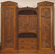
This is a picture of a wardrobe by craftsman Robert Prenzel from Australia around the late 1800s. I find it very interesting particularly since it's a beautifully crafted piece of furniture made in Australia. The arts and crafts movement that originated in ENgland around the mid 1800s influence spread all the way down to the Australian colonies. Currently this wardrobe is held in the National Gallery of Victoria.
Friday, February 27, 2009
Chapter 10
1. Sum up the reading in your own words in 1 paragraph.
This chapter follows the story of William Morris, an Englishman that acted out towards the social, moral and societal changes that happened due to the industrial revolution. He found his job as an architecht dull and contemplated joining the ministry, when he decided he wanted to be an artist. Morris began the arts and crafts movement, starting as a kind of club of artists with the same ideas of using naturalistic materials to create beautiful and original pieces of art work as opposed to the metal, mechanized and boring monotony of creations of industry. He then created Kelmscott Press, where he printed books and more typeface designs including Chaucer and Troy. John Ruskin was another artist and philosopher who advanced the movement. Not only did Ruskin want to expand the arts and crafts movement's message, but he also advocated improvements in housing for factory employees, educational systems, and retirement benefits.
2. Name the one thing (or person) you found most interesting from the reading.
Well, most interesting is the person that the chapter focused on the most. I got an information overload on William Morris. He created over 500 designs for textiles and stuff and lead an art revolution! I can't really blame him though, he does have a great last name.
3. State at least one question you have after the reading.
Chapter 9
1. Sum up the reading in your own words in 1 paragraph.
Chapter 9 focuses on the impact that the industrial revolution had on graphic design. Urbanization began to grow rapidly in both U.S and European societies. People started moving from agricultural farms for the opportunities that the cities held. Thus a demand for mass production of products and technologies in factories was created. Friedrich Koenig invented the steam-powered printing press and typographic design keeps transitioning more and more from religion towards advertisement. People like Joseph Niepec began what was known as phototypography (photography pretty much) with the invention of early cameras.
2. Name the one thing (or person) you found most interesting from the reading.
Fat Face type was interesting to me. Well, not so much interesting as it was funny...haha
3. State at least one question you have after the reading.
These early cameras seemed pretty weird but lenient in their use. Was there a specific standard method for using them? Like, was there an instruction manual to those things or something?
Sunday, February 22, 2009
Exemplary Image for the Text 3

Saint John the Evangelist on Patmos
This is a painting by Tiziano Vecellio, better known as the Renaissance painter Titian. Titian studied to be an artist pretty much his whole life and was named the official painter of the Italian Republic in 1516. He was awarded many other honors by the court of emperor Charles V of the holy Roman empire throughout the course of his life. I first saw this picture in a textbook I had for a Highschool art class. I like the style of it a lot. As with most famous paintings from the Renaissance, it has a lot of detailed illustration with mythological/religious tones in the story it tells. However, Titian's signature in his style is that he loved to use strong and simple colors with strength of contrasts between figures and backgrounds. Titian wasn't a Renaissance man in the same sense of people we studied in the book (with advances in geometry and typefaces), but I feel it's relevant because it's another example of how illustration progressed from Albrecht Durer's pioneering developement in detail to magnificent colored paintings in the Renaissance era.
Wednesday, February 18, 2009
Chapter 8
1.Sum up the reading in your own words in 1 paragraph.
This chapter is all about more and more innovations to graphic design typeface in the 1700s. These innovations include a larger variety of printing, sizes, fonts, and papermaking. Of these new designs, Rococo was the most fancy and ornate. Then the chapter moved on to people who regulated and standardized type into specific fonts: Fournier le Jeune, George Bickham, William Caslon and so on.
2.Name the one thing (or person) you found most interesting from the reading.
John Baskerville was probably the most interesting thing/person talked about in this chapter. He gave older typefaces a more modern style with thicker lines and smoother more eye catching paper.
3.State at least one question you have after the reading.
What's japaned ware?
Chapter 7
1.Sum up the reading in your own words in 1 paragraph.
Chapter 7 dealt with the Renaissance. It focused on the rebirth of design in general including innovations in things like page layouts, books, geometric proportions and illustrations. The chapter went over key influential figures or "Renaissance men" such as Ratdolt, Griffo and Tory. People that offered new thought to things like typeface, pages in books, ect..
2.Name the one thing (or person) you found most interesting from the reading.
Geoffery Tory, the famous French all around artist that came later during the Renaissance period. How could he not be interesting? He was a prodigy! Translator, poet, publisher, ect.. It was also interesting that he believed letter forms were created by God because any letter with a crossbar covered the form of a man
3.State at least one question you have after the reading.
1. Name of graphic style (or topic) studied this session:
The graphic innovations of the Renaissance era.
2. Describe specific qualities of this style (or if it’s a topic-highlights of that topic) that will help you identify it in the future.
The Renaissance gave us a better use of combining illustrations and text in order to educate(as seen with Ratdolt and using drawings to better explain geometry). It also gave us a bigger variety of typefaces(for example, Griffo's itallics).
3. What is the most useful or meaningful thing you learned today?
It is very useful to know about not just the Renaissance men described in the book (Ratdolt, Manutius, ect.) but also the people that worked under/with them. I think a lot of influential people from the past never really got credit for a lot of things because their thoughts and ideas were attributed to the wealthy men they worked for.
Tuesday, February 17, 2009
Chapter 6
1.Sum up the reading in your own words in 1 paragraph.
We have a large focus on Germany and the progression of the printing press with its effects on culture, such as certain people's jobs. It goes over the printing press moving from just letters to illustrations as well. We see the beginning of marketed and mass produced advertising with broadsides, small slips of paper that would sometimes tell the news of town events or stories. It was called the Incunabula period.
2.Name the one thing (or person) you found most interesting from the reading.
Albrecht Durer is by far the most interesting thing/person from this reading. This is a man that brought better, truer detail to illustration, making it possible for even those illiterate masses to comprehend the message of a text just by looking at his pictures.
3.State at least one question you have after the reading.
What exactly does crible mean?
We're shown the things like the Rhino and the Apocalypse with Albrecht Durer, but the book doesn't really explain the purpose of them. What were these detailed pictures for?
We have a large focus on Germany and the progression of the printing press with its effects on culture, such as certain people's jobs. It goes over the printing press moving from just letters to illustrations as well. We see the beginning of marketed and mass produced advertising with broadsides, small slips of paper that would sometimes tell the news of town events or stories. It was called the Incunabula period.
2.Name the one thing (or person) you found most interesting from the reading.
Albrecht Durer is by far the most interesting thing/person from this reading. This is a man that brought better, truer detail to illustration, making it possible for even those illiterate masses to comprehend the message of a text just by looking at his pictures.
3.State at least one question you have after the reading.
What exactly does crible mean?
1. Name of graphic style (or topic) studied this session:
Incunabula.
2. Describe specific qualities of this style (or if it’s a topic-highlights of that topic) that will help you identify it in the future.
Specific qualities of the incunabula period of typographic style includes: illustrations being paired with texts, the "old style" transition from handwritten fonts to more mechanized type, and the beginnings of using written word as advertising.
3. What is the most useful or meaningful thing you learned today?
I learned that the printing press was a very, very, very infinitely important invention. It helped to get more of the masses literate, more informed, and therefore more intelligent. This led humanity to have the kind of "enlightened"/informed societies that it does today starting with revolutions against Kings and tyrants (i.e. French revolution).
We're shown the things like the Rhino and the Apocalypse with Albrecht Durer, but the book doesn't really explain the purpose of them. What were these detailed pictures for?
Sunday, February 15, 2009
Exemplary Image for the Text 2


TOP:
This is the Morris family coat of arms/crest (according to Morris County New Jersey archives). It sports fire, standing for courage;armored helmet standing for knighthood and military service; and lions, standing for audacity and strength. The words "TANDEM VINCITER" translates from Latin to mean "At last it is conquered". As the Chinese did, so did my Celtic ancestors have their own seal to identify those associated with the clan/family. It was placed on banners and scaled down smaller to be used on wax letter seals. The picture and print of the crest suggests an easily noticed Medieval style. The lions, the knights armor; the bold all capital letters. Like I said, it's easy to notice the Medieval style and themes. I first saw not this crest but a very similar looking one with the same Latin "motto" written on it, Tandem Vinciter when I was 14 and looking through books at the library for a report on my heritage. So I used the internet to find this particular image, since I don't have that book with me. Even though no one in my immediate family really sports this crest at all, I think it's cool that some people I didn't even know centuries ago had the same last name as me.
BOTTOM:
This is a graffiti alphabet made by a graffiti artist, TORC, out of Perth, Australia. I saw it online in a graffiti artist forum. I thought it was interesting(to me at least) because I'm a big fan of graffiti and street art. As we learned with illuminated manuscripts, alphabets started to adopt different styles(classic, Gothic, Roman, ect...), and therefore different fonts. Graffiti is a font created toward the end of the 20th Century. The reason he laid out an alphabet in his own style was to show other potential graffiti artists what kind of look Australian spray paint had and hopefully inspire them.
Friday, February 13, 2009
Chapter 5
1. Sum up the reading in your own words in 1 paragraph.
Chapter five was basically about this German guy, Gutenburg, and his invention of movable type and most notably the printing press. The chapter told more about Gutenburg's life and struggles then progressed into block printed books and cooperplate engraving.
2. Name the one thing (or person) you found most interesting from the reading.
I found it very interested that the type of material used to make playing cards was dependent on one's social status.
3. State at least one question you have after the reading.
Was the concept of patenting things prevalent in Gutenburg's time?
1. Name of graphic style (or topic) studied this session:
Typography and printing.
2. Describe specific qualities of this style (or if it’s a topic-highlights of that topic) that will help you identify it in the future.
The only real "highlights" of the topic I can think of is that Gutenburg was German and was the actual father of the printing press, even though it took decades(centuries?) for him to be accredited.
3. What is the most useful or meaningful thing you learned today?
I learned that the German and the Dutch were at a race with one another to invent a working printing press. The factor that really determined who would win was which could get the iron press to cool faster/more efficiently so as not to damage the paper.
Subscribe to:
Comments (Atom)

